Last updated on
Discover the vibrant hues and nostalgic charm of the retro color palette and learn how to incorporate these classic shades into your modern design projects.
Key takeaways:
- Retro color palettes reflect the social and cultural vibes of past decades.
- Each era had different characteristic colors and combinations.
- Texture and patterns play a crucial role in retro color schemes.
- Seek inspiration from mid-century advertising, design movements, and vintage fashion.
- Vintage color palettes can be used for throwback branding to evoke nostalgia.
The Retro Color Trend
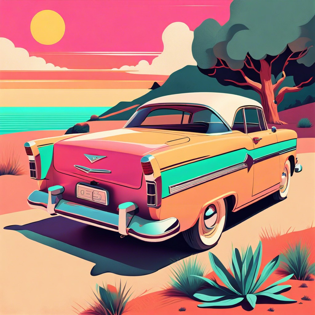
Retro hues often reflect the social and cultural vibes of past decades. Each period favored specific palettes that not only defined the era’s aesthetic but also influenced design across all mediums. The 1950s were known for their pastel tones, embodying post-war optimism. Moving into the 1960s and 1970s, the palette shifted to bolder, psychedelic colors, echoing the countercultural revolution. The 1980s were marked by neon signs and vivid contrasts, mirroring the decade’s technological advances. Understanding these transitions helps us grasp the emotional and historical contexts encapsulated in retro color palettes.
Characteristics of Retro Schemes
Retro color schemes often reflect the aesthetic trends of the 50s, 60s, 70s, and 80s. Each era favored different colors and combinations, imbuing them with cultural significance that persists today.
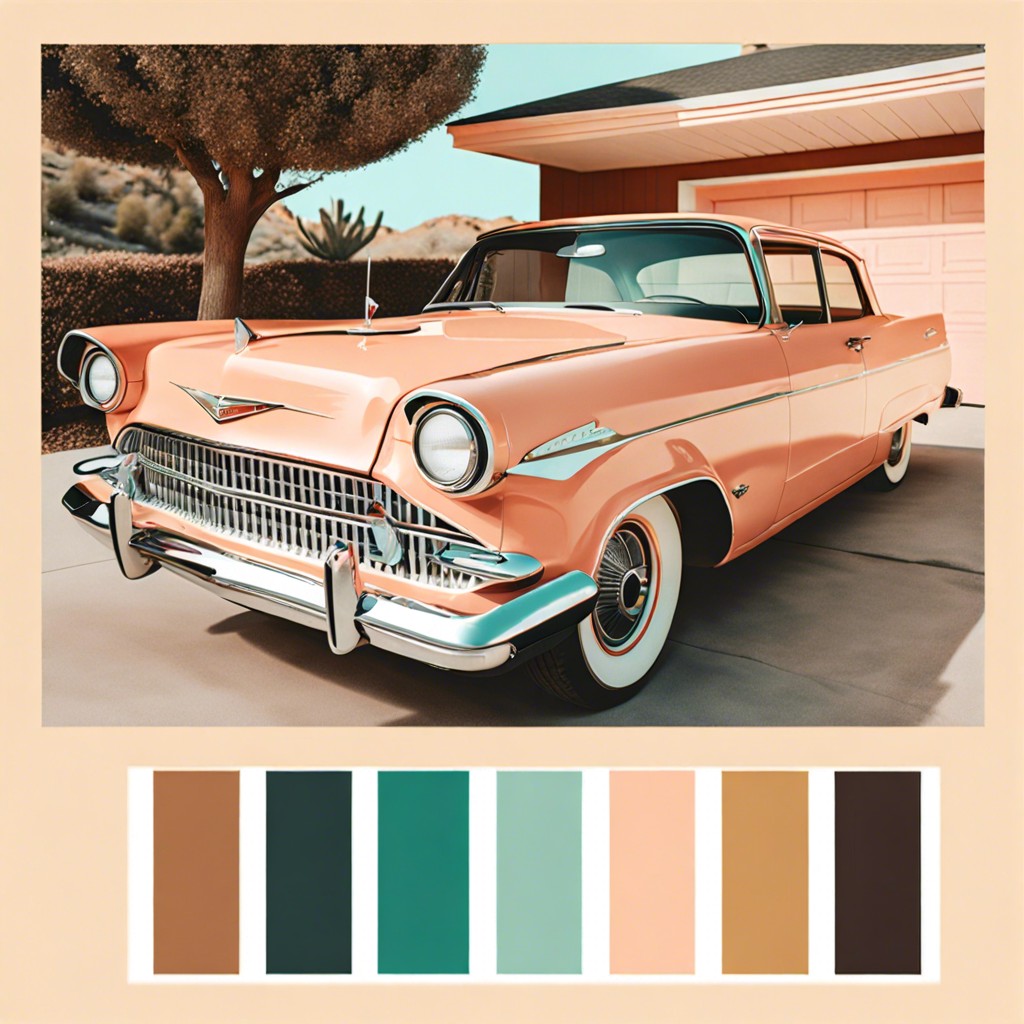
The 1950s were known for soft pastels such as mint green, soft pink, and turquoise, evoking a sense of optimism post-World War II. These colors were commonly found in household appliances and cars, signifying the era’s technological advancements and domestic growth.
Moving into the 1960s, vibrant and psychedelic colors became popular. Vivid oranges, pinks, and purples dominated, mirroring the social revolutions and the rise of pop art and youth culture.
The 1970s introduced a more earthy color palette, with harvest gold, avocado green, and brown. This reflected the decade’s focus on environmental issues and the back-to-nature movement.
The 1980s were characterized by bold and neon colors. Bright blues, hot pinks, and electric yellows captured the decade’s flashy and exuberant spirit, influenced by the advent of digital technology and video games.
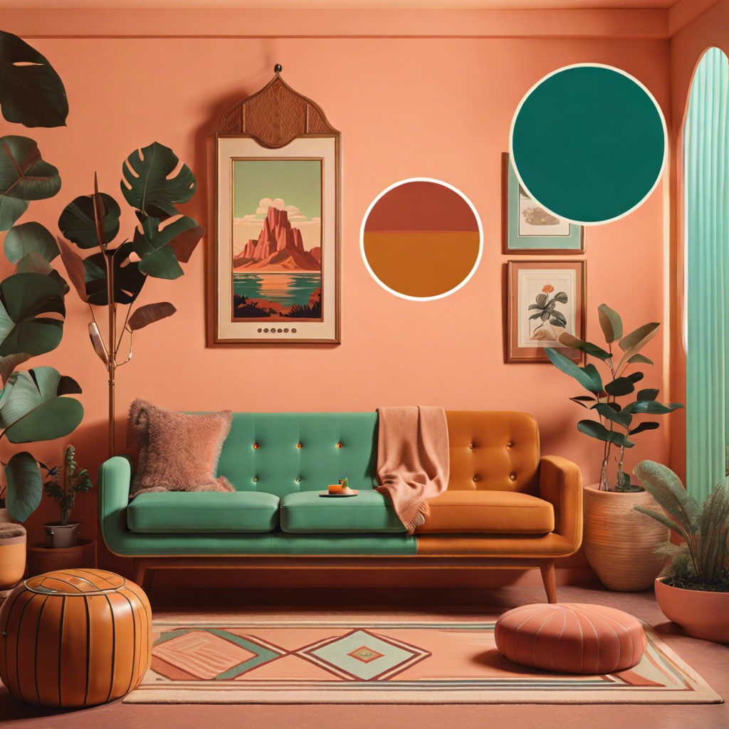
Texture and patterns played a crucial role in retro color schemes. Combining colors with specific patterns—like the bold geometry of the ’60s or the organic, flowing designs of the ’70s—amplifies their retro feel.
Understanding the sentiments behind these palettes facilitates a more authentic application of retro color schemes in contemporary design, allowing for classic yet fresh visuals.
Retro Color Inspiration
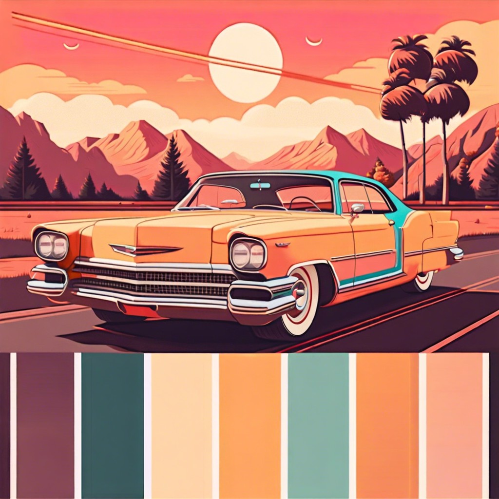
When seeking inspiration for a retro color palette, consider various aspects of past eras. Look to mid-century advertising and product packaging for bold, saturated hues typical of the 1950s and 1960s. Television shows and films set during these times can also be rich sources, encapsulating the essence of the period’s aesthetic.
Design movements such as Art Deco and Pop Art offer a wealth of color inspiration as well; the former is known for its luxurious and geometric elegance, while the latter is recognized for its bright and contrasting colors. Vintage fashion is another avenue to explore; it provides insights into the popular colors of past decades.
Examine historical color catalogs and paint brochures. These materials often reflect the popular color trends for interior design and architecture of their time. Such resources can serve as a direct link to the preferred palettes of the past.
Additionally, take cues from the natural aging process of materials. Fabrics, papers, and other mediums may fade over time, softening their colors and giving a unique patina that can inspire a more authentic retro palette.
Vintage Color Palettes for Throwback Branding
Harnessing vintage color palettes in modern branding invites nostalgia and can differentiate a brand in a crowded marketplace. These palettes often reflect the design sensibilities of specific decades, capturing the spirit and social dynamics of the times.
Aesthetic resonance matters. For instance, the pastel hues popular in the 1950s suggest a mix of post-war optimism and the era’s distinctive fashion trends. Conversely, the bold, saturated colors of the 1980s mirror the flamboyance and digital fascination of that decade.
Integration with contemporary design is essential. While utilizing retro colors, successful branding harmoniously blends them with current design principles to communicate both timelessness and relevance.
Authenticity is key. Brands that choose a vintage palette should ensure it aligns with their values and message, thus creating an authentic connection with their target audience.
Adaptability across media is a practical consideration. Vintage colors must translate well both in digital formats and in print to maintain consistency and effectiveness of the brand’s visual identity.
Understanding color psychology is beneficial. Colors evoke emotions and can significantly influence consumer behavior, making the choice of a vintage palette a strategic decision in brand storytelling and marketing.
![What Colors Go with Burgundy Curtains [13 Ideas]](https://banterbanner.com/wp-content/uploads/2021/04/burgundy-curtains-1.jpg)
![What Color Walls Go with Maroon Carpet? [Solved]](https://banterbanner.com/wp-content/uploads/2021/04/earthy-wall.jpg)
![What Colors Go with Hunter Green Carpet? [8 Ideas]](https://banterbanner.com/wp-content/uploads/2020/11/hunter-green-carpet-3521831.jpg)
![What Colors Go with Burgundy Furniture [8 Ideas]](https://banterbanner.com/wp-content/uploads/2020/11/burgundy-furniture-1619334.jpg)
![What Colors Go with Burgundy Carpet? [7 Ideas]](https://banterbanner.com/wp-content/uploads/2020/11/burgundy-carpet-9150918.jpg)