Last updated on
This article will shed light on the allure and significance of vintage logos and how they reflect a company’s heritage and brand identity.
Key takeaways:
- Vintage logos reflect historical context and design evolution.
- Nostalgia evokes emotions and strengthens brand connection.
- Vintage logos include key characteristics like typography, colors, and symbols.
- Successful vintage logo redesigns honor the past while embracing the future.
- Authenticity in vintage logo design builds trust and loyalty.
Historical Significance of Vintage Logos

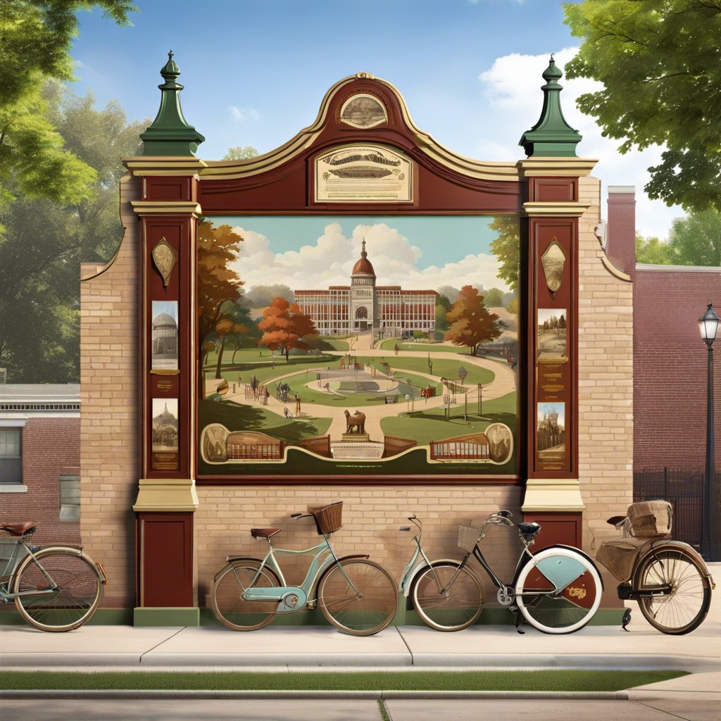
Vintage logos serve as time capsules, encapsulating the visual and cultural sensibilities of their era. These designs reflect the historical context in which they were created, often exhibiting the technology, materials, and aesthetic preferences of the time. They can illustrate the evolution of graphic design, showcasing how typography, color palettes, and imagery have shifted over the decades.
Businesses with long histories may retain elements of their original logos to signify tradition and endurance. This helps to establish trust and loyalty with their customer base, who may view longstanding brands as more reliable. Conversely, newcomers to markets sometimes adopt vintage styles to suggest a heritage they aim to cultivate.
Furthermore, they speak to the origins of brand storytelling. Before the digital age revolutionized advertising, logos were a primary means of communication. The economy of design in earlier logos meant each line, shape, and font choice was deliberate, aiming to convey the company’s values and services quickly and effectively to consumers.
Impact of Nostalgia On Brand Identity
Nostalgia has a powerful influence on consumer behavior. It evokes emotions that can lead to a deeper connection with a brand. When established companies reinstate their retro logos, they tap into a collective memory bank. This strategy can stir up feelings of trust and comfort in customers.
Vintage logos serve as reminders of simpler times. They often cut through the noise of modern designs, offering a sense of stability in a fast-paced market. This familiar visual language can rekindle loyalty among long-time customers while simultaneously intriguing newer audiences.
Moreover, recalling a storied past can position a brand as an industry veteran with enduring values. In a landscape where authenticity is highly prized, a well-designed vintage logo stands as a testament to a brand’s rich heritage and commitment to quality over years of service.
Remember, it’s not about looking backwards but leveraging yesteryear’s charm to forge ahead. A blast from the past might just be what propels a brand into the future.
Components of a Vintage Logo
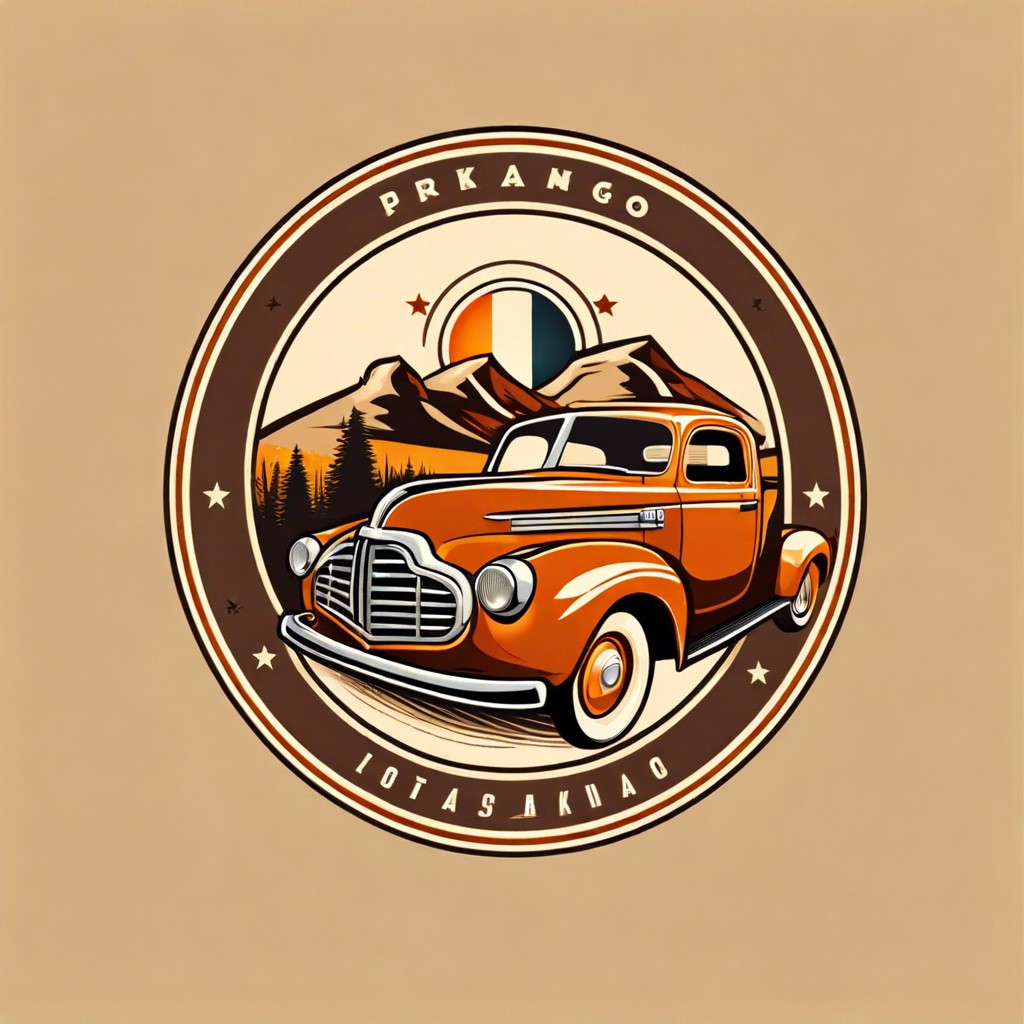
Examining a vintage logo reveals certain key characteristics. The typography often includes serif or script fonts that exude a classic feel, anchoring the logo in a bygone era. Textures and patterns, for example, grainy effects or stripes, are frequently used to add depth and an old-fashioned touch.
Color palettes in vintage logos tend to be muted or inspired by the era they represent, often relying on earth tones or pastels. These colors evoke a sense of history and warmth.
Symbols are pivotal in conveying the logo’s retro vibe. Classic icons such as ribbons, stars, or shields connote tradition and longevity.
Simplicity is also a hallmark of vintage design. Despite the inclusion of these detailed elements, the overall composition remains concise and readable, avoiding an overly busy look that can dilute the impact.
Finally, there’s a subtle balance to maintain; these logos blend historical aesthetics with modern sensibility to remain relevant and accessible to contemporary audiences.
Case Studies: Successful Vintage Logo Redesigns
A stroll down memory lane brings us to a handful of brands that have elegantly revamped their logos, giving us a masterclass in striking the perfect balance between honoring the past and striding into the future.
Take, for instance, Kodak. In 2016, they resurrected the iconic “K” symbol and warm color palette — a wise move that harkens back to the company’s heyday and reaffirms its legacy in the photography business.
Next, there’s the case of Coors Banquet. The beer brand’s logo redesign subtly refreshed the typeface and retained the emblematic golden color. This change strengthened brand recognition without alienating loyal consumers.
Not to be outdone, Netflix also tipped its hat to tradition. While markedly modern, their move to an ‘N’ emblem subtly nods to the curvature and red color found in earlier logo iterations, proving that sometimes less is more in design.
Lastly, Burberry showcased how luxury brands could also embrace heritage. Their 2018 logo update maintained the sophistication of the brand while providing a sleek, contemporary twist, proving elegance doesn’t have to scream to be heard.
In these examples, the common thread is a respect for their legacies and an understanding that a logo links the brand’s history with its current identity, ensuring a seamless transition that keeps the past alive for future generations.
Authenticity in Vintage Logo Design
Authenticity begets trust, and trust is currency in the marketplace. When crafting a logo with a vintage feel, genuineness is the golden ticket. It’s about subtle whispers of yesteryear rather than blatant shouts. Elements like hand-drawn features or typography that nods to a specific era can stir up the authenticity stew quite nicely.
The choice of color palette is also crucial. Muted tones that echo the past can call to mind a sense of tradition and longevity. Think of the sepia tones of an aged photograph or the faded hues of an old billboard.
Texture plays a pivotal role as well. A logo that includes a sense of wear or patina can evoke the passage of time. This might come through in a slightly distressed font or a background that suggests a rich history, like the pages of a well-loved book.
Lastly, balance modernity and history. A logo that is too rooted in the past may not resonate with present-day sensibilities. Integrating modern design principles ensures relevance while honoring the past, akin to restoring an antique car to its former glory with a contemporary engine under the hood.